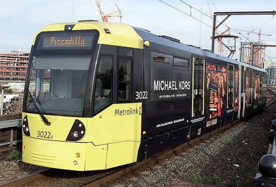
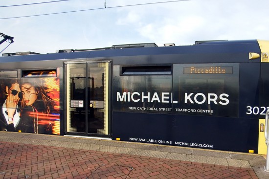
The latest M5000 to receive a vinyl wrap advert livery is 3022 which has received a black based livery for Michael Kors, and yes there is extensive use of contravision. This is the first full advert to be carried by 3022 but becomes the fifth M5000 to carry an advert in 2016 (with 3058 being the recipient of two designs). Photos courtesy of Steve Kemp.


It looks a mess and demeans public transport. Tony Stevenson
Quite surprised by the design as understood it was legal requirement on UK Systems to have contrasting colours on doors. (more than the small yellow bar). Hence another system when applying a all over advert for the first time to a LRT had to amend a vinyl design to ensure doors were contrasting colour.
Who or what is Michael Kors?
“Michael Kors is a world-renowned, award-winning designer of luxury accessories and ready-to-wear. His namesake company, established in 1981, currently produces a range of products under his signature Michael Kors Collection and MICHAEL Michael Kors labels. These products include accessories, footwear, watches, jewelry, men’s and women’s ready-to-wear, eyewear and a full line of fragrance products. ” In other words it is a shop!
Truly horrible, quite possibly the worst vinyl wrap advert yet!
I agree with Tony. Its disgraceful that vehicles are mutilated in this way. I have one word for it — UGH!
Given the amount of R.T.C’s where the pedestrians and car drivers say they did’nt see the tram,i would have thought the worst colour you could wrap a tram in was jet black.
Even when the trams are in the bright yellow fleet colours, drivers and pedestrians have trouble seeing them!
Interesting to see the amount of comments being generated about this tram, no only here but on other sites as well. From a commercial point of view, the contract has been fulfilled as the amount of publicity this is generating for a business which was not well known previously is substantial! Like it or hate it, it is doing the job it was designed to do.
If trams ( but WHY NOT BUSES AS WELL) must be disfigured in this way, at least let the windows be left uncovered. It is not possible to see out clearly when they are covered in this way, and impossible to get a sense of the attractive country many areas of the tram lines traverse.
There are many buses so ‘disfigured’ in fleets nationwide, and in some areas it is also spreading to taxis. In Greater Manchester alone there must be at least 10 times as many buses as there are trams in overall Ads…
That’s not to support the use of contravision (some certainly is excessive and unnecessary such as the positioning of the name at least in this example which could so easily have been positioned on the plain black areas above or below the windows), but to dispel the myth that it is only trams inflicted…
Additional income, my dears. It’s not rocket science!!